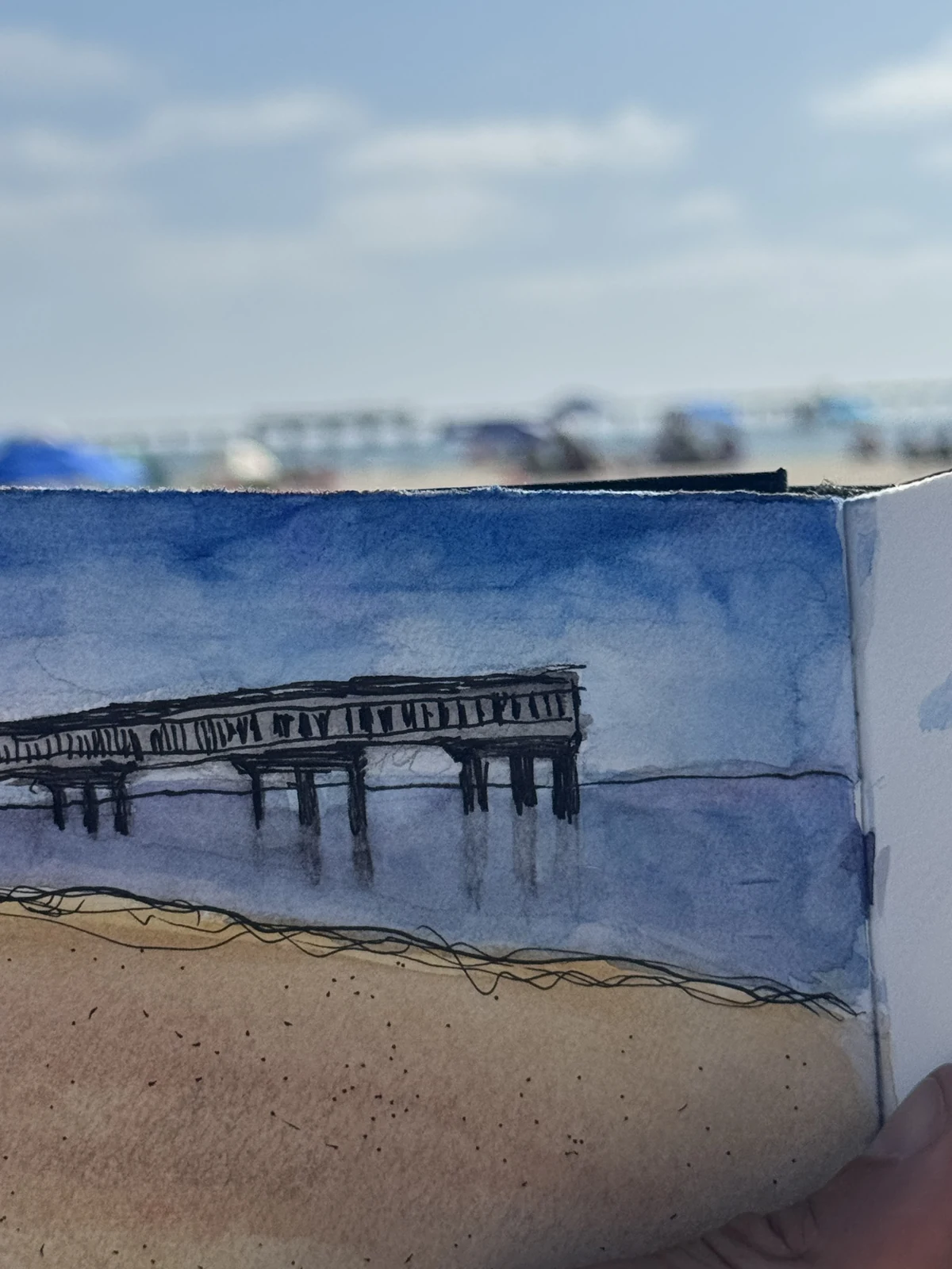
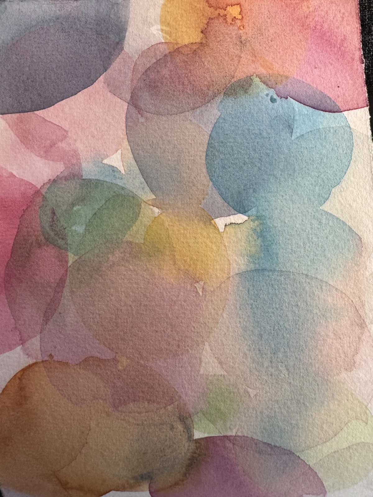
I've been painting more watercolors myself over the last six months, and I wondered what I could do digitally that had a similar feel.
The first version of my watercolor camera looked like a photo printed on plaster. It had texture, but it didn't look much like paint.
Lifting the darks and toning down the paper helped. So did simplifying the picture before putting any texture on it.
Start with shapes
A camera picks up every little change in the surface of something. Keep all of that detail and add paper grain, and you get a detailed photo with paper grain.
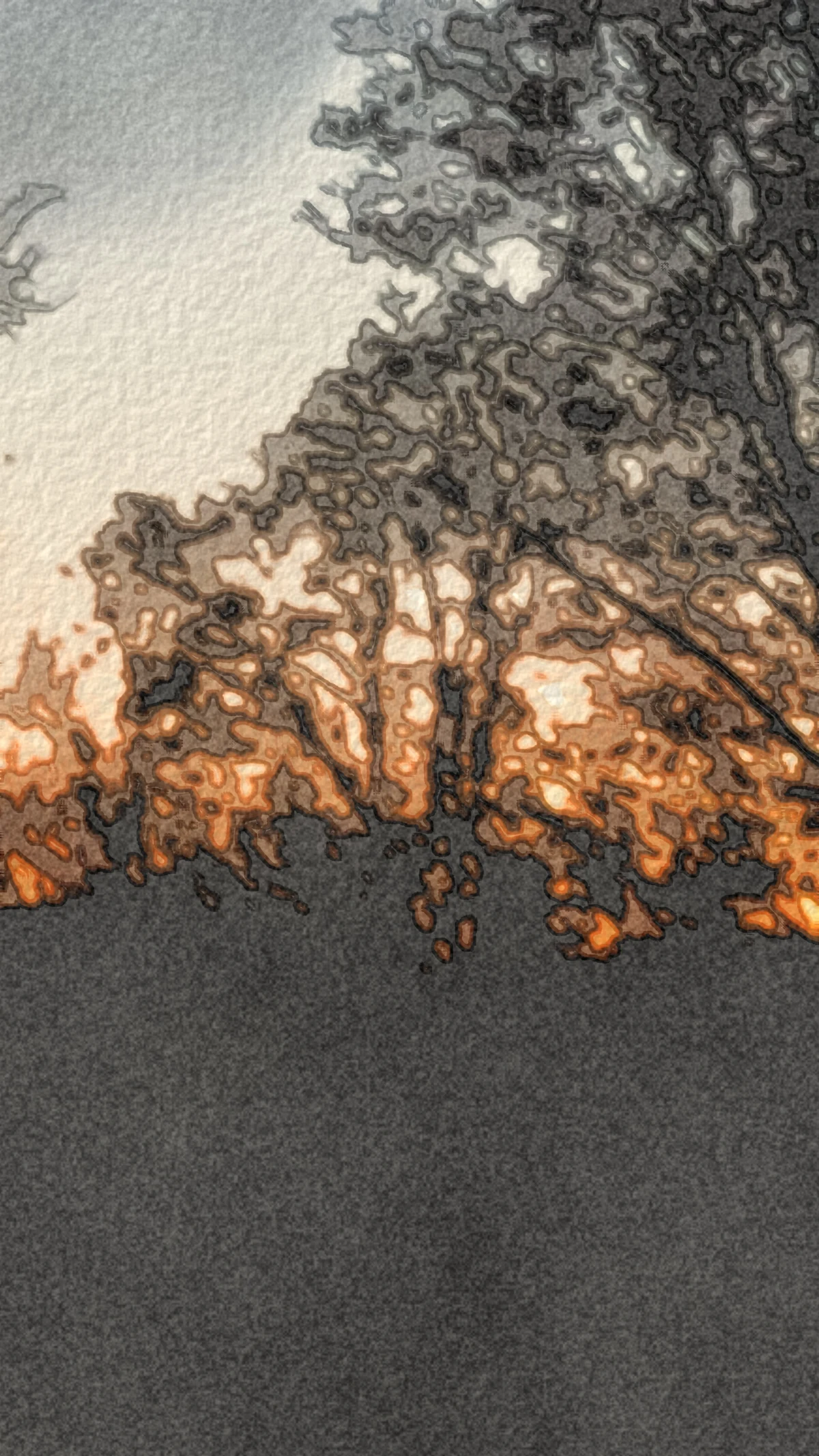
The filter starts by smoothing small details into larger patches of color. It uses the same Kuwahara filter as my cartoon camera: nearby areas with similar colors get averaged together, while boundaries between different colors stay more distinct. There's an interactive explanation here.
For watercolor, the first smoothing pass runs on a smaller image. That lets it reach across more of the scene, so fine texture gives way to broader shapes. A second, lighter pass helps keep their boundaries defined.
Then the colors get uneven. Some patches darken as if there's more pigment there. Others get lighter. A blurred copy of the picture blends in more strongly in some places than others, suggesting the way wet paint spreads. Small offsets make the edges less mechanically straight.
The approach draws on Bousseau and colleagues' watercolor-rendering paper. This is a collection of visual effects, not a simulation of water flowing or paint drying.
Less plaster
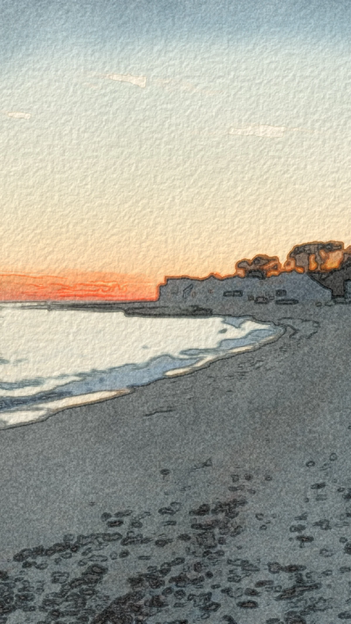
The paper had too much relief. Light and shadow made its little bumps stand out, so the whole picture looked like a rough wall. Reducing that shading made the surface quieter without removing the grain.
The darks needed adjusting too. The shader moves colors toward white and lets the brightest areas fade into the paper color. Increasing that lift helped this version feel more like a light wash.
That doesn't mean watercolor can't have deep darks. It can. This was a choice for this particular filter, not a rule about painting.
The changes also included soft layers of tone, with darker rims based on their boundaries. That gives the edge effect larger shapes to follow instead of emphasizing every little bit of photographic texture. Fine grain still varies with the amount of pigment, so quieter paper doesn't have to mean perfectly flat color.
Looking at the result
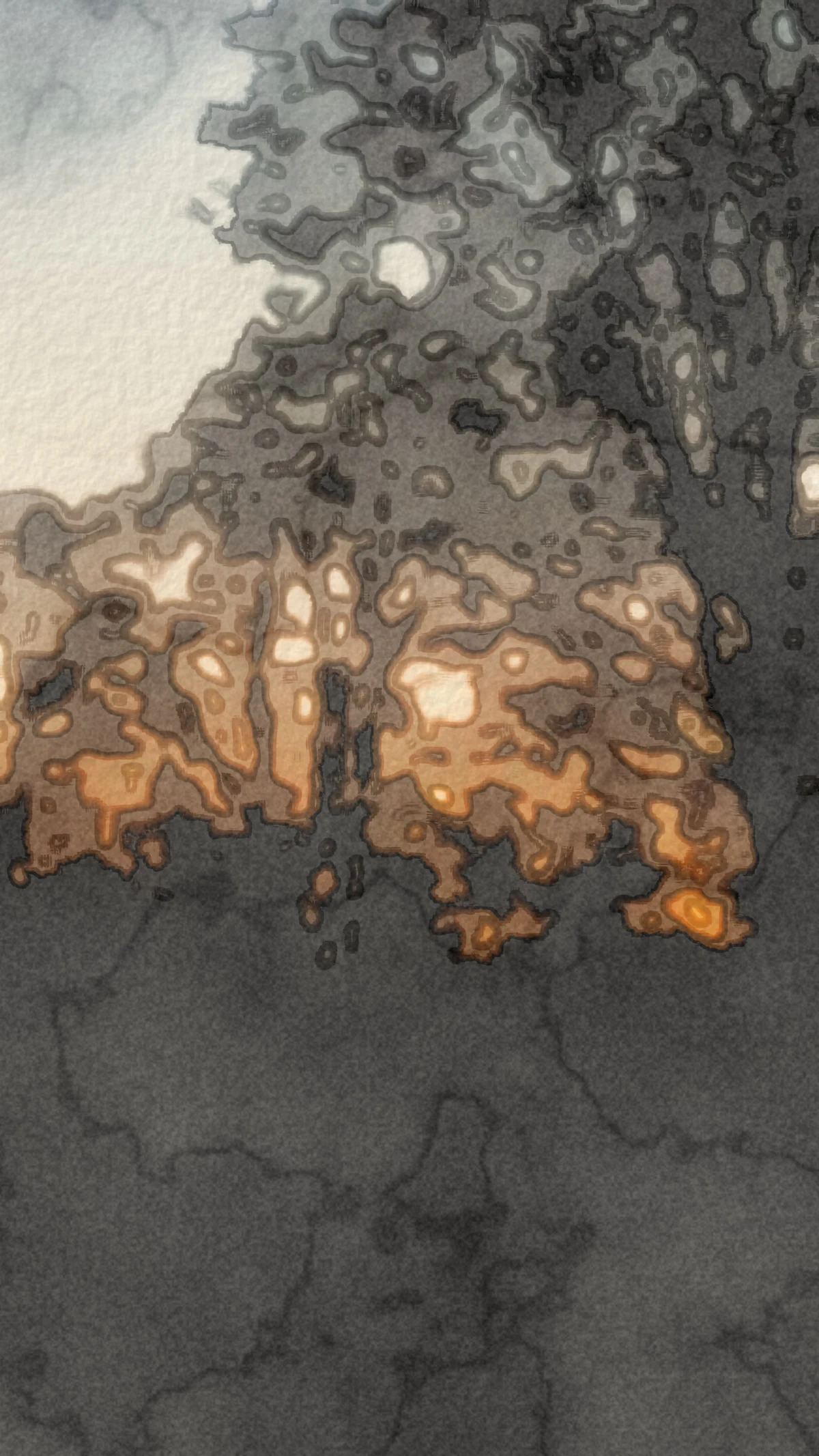
Pointing the camera at real dark objects was the best way to refine it. Judgement and taste matter a lot here. The algorithm can run exactly as written and still produce something that doesn't look right.
This became the Watercolor look in Lightdab. I'd still like more definition where things should look like dry brush. Some of it comes out a bit too washed, and I want to refine that.
If you want to try it, the watercolor camera runs in your browser.